
 SHOP
SHOP









 Our Collection
 Nederlands
 Deutsch
 Français
Beauty News, Dutch Home and Living
Autumn in Full Bloom: This Season’s Colours and How to Style Them With Silk Flowers
Oct
Outside, the garden is winding down. Inside, we want the opposite: warmth, colour and something beautiful on the table. Autumn is when silk flowers earn their place, because they look as good in November as they did the day you unpacked them.
This year there is also a clear colour story to follow. Here is what is trending for autumn 2026, and how to bring it home with stems from our collection.
The Autumn 2026 Palette
Interior designers agree on one thing this season: the mood is muted and earthy. Instead of the bright pumpkin orange we usually associate with autumn, the 2026 palette is softer and more grown up. Think burgundy, terracotta, chocolate brown, olive and moss green, golden yellow and dusty berry shades.
The common thread is warmth. These are colours that make a room feel like a hug, and flowers happen to do them beautifully.
Burgundy and Dusty Berry
Burgundy is one of the standout colours of the season, and it’s easy to see why. It has the depth of red wine without the loudness of true red, so it feels rich and calm at the same time. In a home full of cream, wood and linen, a few burgundy flowers work like a warm accent that pulls the whole room together.
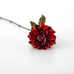
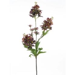
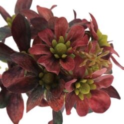
The Dahlia Burgundy is a perfect place to start, with a full, velvety bloom that looks rich on its own in a slim vase. The Antique Roses bring a more vintage feel, with their faded burgundy and tan tones, and the Chrysanthemum Burgundy Monaco adds height and a spidery, textured shape.
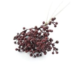
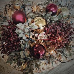
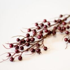
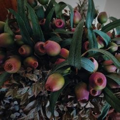
For the dusty side of the berry trend, the Old Hydrangea small and the Hydrangea Old Pink soften everything with muted rose and cream. Berry stems finish the look: the Burgundy Berry Bundle and the Cranberry Spray Burgundy add dark, glossy colour that feels very much like autumn.
Styling tip: Burgundy looks its best against dark green, olive or cream. Try one single Dahlia Burgundy in a small vase on the dining table, and put a few berry stems in a taller vase by the window. Repeating the colour in two places makes the whole room feel considered, without needing a big arrangement.





Rust, Terracotta and Burnt Orange
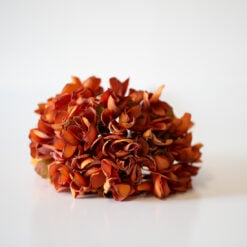
Terracotta is still a firm autumn favourite, and this year it leans more muted: less orange, more earthy. It’s the colour of clay pots, dried leaves and late afternoon light, which is why it feels so at home in a house in October.
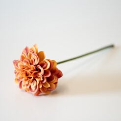
Burnt orange works best as an accent, so a few well-chosen stems go a long way. The Autumn Chrysanthemum is a strong statement in a deep, glowing orange, while the Chrysanthemum Deep Rust is a shade darker and more refined. The Hydrangea grand rusty brown gives you volume in a single stem, so it’s the easy choice if you want a full, lush look without a lot of arranging.
For something more unexpected, the Bunch Of Rust-Colored Tulips prove that tulips are not just for spring. The Wild Chamomile Spray Orange adds a looser, wilder feel, and the Viburnum grey-rust brings in a softer, muted tone for contrast.
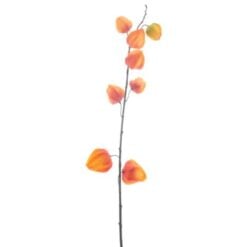
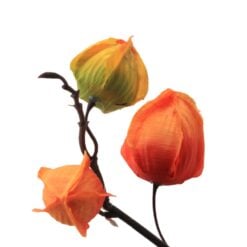
Then there is the Physalis Spray Orange. With its little lantern-shaped pods, it is as autumn as it gets, and it adds an airy, delicate line to a heavier arrangement.
Styling tip: Rust looks beautiful with cream, olive green and dark brown. Put two or three rust chrysanthemums in a cream or sand-coloured vase and let the physalis arch over the side. Because the colours are muted, the whole thing feels warm without looking like a harvest festival.
Chocolate Brown and Natural Texture
Brown has become one of the most interesting colours in interiors, and chocolate brown leads the way. It grounds a room and makes the brighter colours around it look richer, which is exactly what you want from a flower arrangement in autumn.
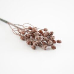
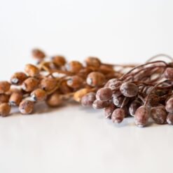
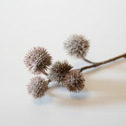
The Antique Coffee-Coloured Dahlia is a lovely example, warm and slightly faded, as if it has spent the whole season in the sun. The Olive Bush Coffee brings small, berry-like clusters in a soft, milky brown, and the Glitter Chestnut Branch adds spiky chestnut burrs with a hint of shimmer. Together they give you the look of an autumn walk, without the muddy boots.
For more depth, the Hydrangea medium brown-red gives a fuller, dustier look, and the Chrysanteum Brown With A Touch Of Rust bridges the gap between brown and rust.
Texture matters just as much as colour this season. Mixing soft petals with rough, woody stems is one of the best tricks for making silk flowers look natural, because real arrangements are never perfectly smooth.
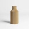
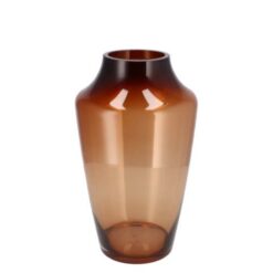
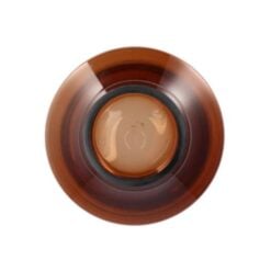
Styling tip: Put these stems in the Vase Milou Brown and the whole thing feels intentional. A tone-on-tone look, with brown stems in a brown vase, is calm, modern and very easy to get right.




Moss, Olive and Deep Green
Here is the twist in this year’s palette: alongside all the warm tones, green is having a moment. Olive and moss shades are everywhere, and they make a nice contrast to all the rust and burgundy.
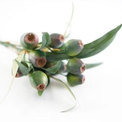
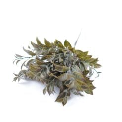
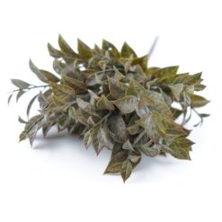
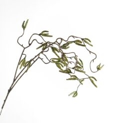
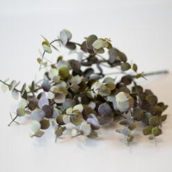
This also makes foliage and branches more valuable than ever, so do not treat greenery as filler. The Olea europeaea, a branch with olives, is a natural fit for an earthy look. The Artificial Lauro Bush in bronze has a deeper, almost metallic leaf that picks up the warm tones in the rest of your arrangement. The Hazel Twig brings a graceful, curving line, and the Eucalyptus Bush adds a grey-green softness that calms everything down.
If you want a fresher green, the Fraxinus Leaf Branche and the Willow Spray Green bring a lighter, airier feel.
Styling tip: A tall vase filled only with branches can look as striking as a bouquet. Use the Hazel Twig for height and the Eucalyptus Bush lower down, and you have an arrangement that looks like it belongs in a country house. It also works as the backdrop for a single bright flower, if you want one.
Golden Yellow and Warm Neutrals
A touch of golden yellow is the easiest way to add light to a dark autumn day. It’s the colour of low sun and fallen leaves, and a little of it makes a room feel brighter without feeling summery.
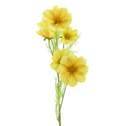
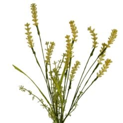
The Cosmos Bibi Yellow is cheerful without being loud, and it looks especially good next to rust and burgundy stems. The Flowering Grass Yellow adds movement and a meadow-like feel, and it fills out a vase beautifully when you do not have many large flowers. For a looser, wilder look, the Wildflower Yellow is a lovely addition.
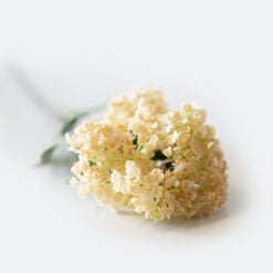
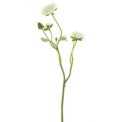
Warm neutrals keep everything balanced. The Hydrangea spray creme and the Ranunculus Creamy are the calm backdrop that lets the richer shades stand out, and the Full Cream Dianthus adds a soft, frilly texture that stops an arrangement from feeling too heavy.
Styling tip: If you are new to autumn colours, start with yellow and cream. They work with almost any interior, and you can add rust or burgundy later as you get a feel for it.


Ready-Made Autumn Bouquets
If you would rather skip the arranging, a few of our bouquets look made for the season. Each one is put together by hand, so the colours and shapes already work together and all you need to do is put it in a vase.
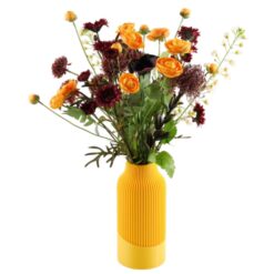
Bouquet Autumn lives up to its name with deep burgundy and orange tones, and it is the closest thing to the trend palette in a single bunch. Bouquet Emily leans into dark, moody berry shades for a richer, more dramatic look. Bouquet Kimberley mixes dark flowers with branches for a wilder, woodland feel, while Bouquet Be Happy brings in bright orange and yellow poppies for anyone who wants a warm pop of colour.
Styling tip: A ready-made bouquet works best when the vase does not compete with it. Choose a plain, matte vase and put the bouquet where it will catch the evening light.
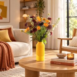
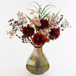


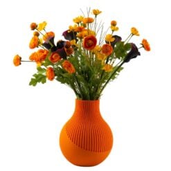
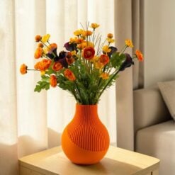
Autumn only lasts a few weeks, but your flowers can stay as long as you like. Pick the colours that feel like your home, put them where you will see them every day, and enjoy the season.
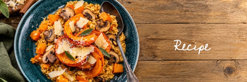
(Recipe) Creamy Pumpkin Risotto with Sage Butter
A comforting autumn dish with roasted pumpkin, golden mushrooms and fragrant sage butter. When the [...]
Oct
Rose in Skincare: A Guide to Rose Water, Rose Oils and Everything In Between
Rose has been part of beauty for centuries, from rose water on the skin to [...]
Oct
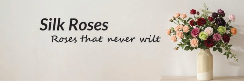
Silk Roses: How to Choose the Right Rose and Make It Look Beautiful
Everyone knows what a rose looks like, and almost everyone has a favourite. The problem [...]
Oct

FAQ about VIVO Red Light Therapy
Wilma Explains:Frequently asked questions about VIVO Red Light TherapyThese FAQ will be updated regularly with [...]
Oct
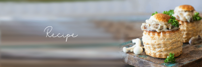
(Recipe) Mushroom Ragout
This creamy mushroom ragout is a cosy classic: deeply savoury, full of texture, and perfect [...]
Oct
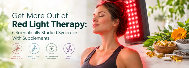
Red Light Therapy and synergy with supplements
Wilma Explains: Get More Out of Red Light Therapy: 6 Scientifically Studied Synergies With Supplements [...]
Oct
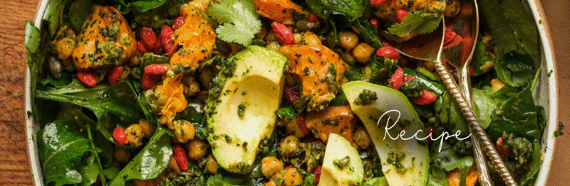
PUMPKIN-CHICKPEA “Para-Herb Defense” Salad
This deeply nourishing seasonal salad is packed with high vibrational foods to awaken the digestive [...]
Oct
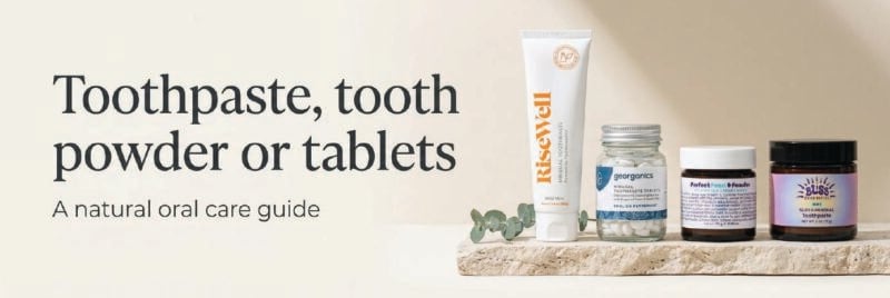
Toothpaste, Tooth Powder or Tablets: Which One Is Right for You?
For a long time, the toothpaste aisle came down to one question: which flavour of [...]
Oct
 Beauty Products
 View all
 By Skintype
 Brands A-Z
 Wellness
 Health / Nutrition